
Complex web apps often need more than standard line or bar charts. They may involve custom interactions, large datasets, advanced chart types, filters, drilldowns, live states, visual comparisons, and layered user workflows. Examples include analytics platforms, engineering tools, scientific interfaces, BI products, product dashboards, and internal data systems. The library you pick affects frontend architecture, speed, and future maintenance. Choose the wrong one, and your team may have to rebuild the visualization layer after launch.
This list includes different approaches: commercial high-performance charting, low-level custom visualization, declarative chart specs, analytical plotting, and dashboard-friendly charting. Each tool has its own scenario, so popularity or chart type count should not be the only deciding factor. The five libraries below were selected because each one solves a different part of the complex JavaScript visualization work.
1. SciChart
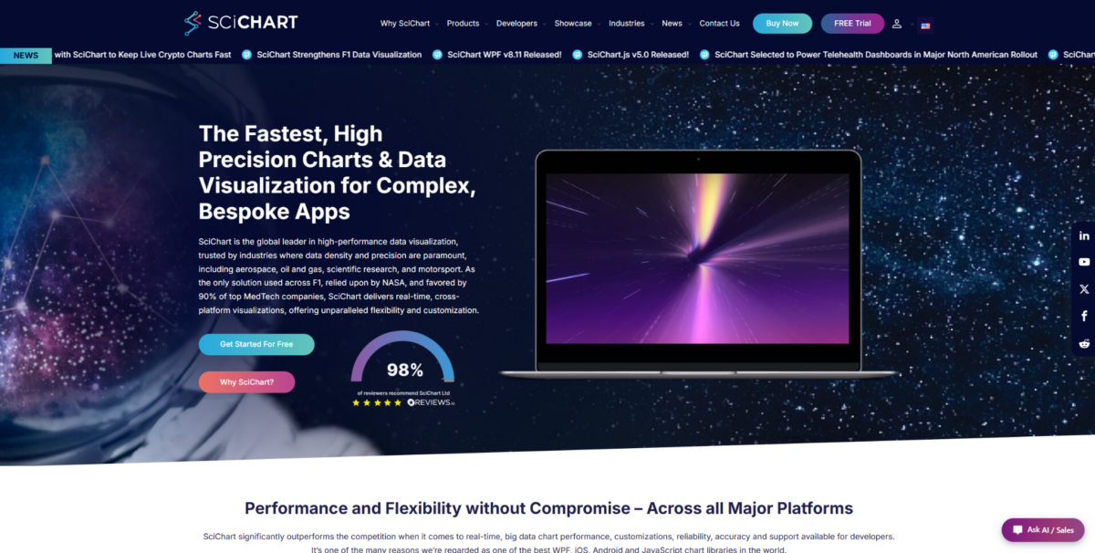
SciChart fits complex web apps where charts must handle large datasets, advanced visuals, and detailed browser interaction. Financial platforms, scientific tools, engineering systems, medical software, and monitoring interfaces are natural use cases. In such products, teams can use SciChart data visualization library without rebuilding chart logic from scratch. It is not a universal choice for every project. SciChart looks best when the visualization layer is a core part of the product.
The library helps not only through speed, but also through rendering quality, chart variety, interaction control, and production support. It offers 2D charts, 3D charts, heatmaps, gauges, polar charts, annotations, zooming, and panning. That mix matters when charts need to support real product workflows rather than sit on the page as static visuals. The main reasons to consider SciChart are practical:
- Handles large datasets and frequent updates in browser-based applications;
- Supports advanced visuals such as 2D charts, 3D charts, heatmaps, gauges, and polar charts;
- Gives developers control over annotations, styling, interactions, and chart behavior;
- Provides examples, demos, documentation, and implementation support;
- Suits commercial products where chart quality affects the user workflow.
SciChart may be too much for small dashboard pages or simple reports. It is a commercial library, so it makes sense when advanced visualization actually matters to the product. For data-heavy web apps, the cost can be justified through stability, speed, and fewer technical limits.
Main Strengths
SciChart is strongest in fast rendering, advanced chart types, and detailed control over chart behavior. It is not the simplest starting point, but it is one of the most relevant options for complex chart-heavy products. Teams should consider it when visualization is part of the main user experience, not just a supporting screen.
2. D3.js
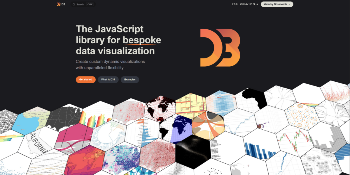
D3.js is a low-level JavaScript library for custom data visualization, not a simple, ready-made chart library. It gives strong control over scales, shapes, transitions, layouts, and DOM or SVG logic. Teams often use D3.js for custom analytics interfaces, visual storytelling, data journalism, research tools, and non-standard dashboards. It is not the fastest route to building a product dashboard. D3.js becomes valuable when the ready chart components feel too restrictive.
The main value of D3.js is the freedom to build custom visuals. A team can create almost any visual structure, but that freedom comes with more manual work. This makes D3.js a better match for experienced developers than for teams looking for quick dashboard components. Its main strengths are tied to control and custom design:
- Gives developers low-level control over data binding, scales, shapes, and layouts;
- Supports highly custom visualizations that standard chart libraries may not cover;
- Works for data storytelling, research interfaces, and unusual analytics products;
- Allows teams to design chart behavior around a specific product experience;
- Fits developers who are comfortable building visualization logic manually.
D3.js can be a very strong tool, but it does not always save time. If your team needs ready dashboard charts, a documentation-driven setup, or commercial support, other libraries may be more practical. Choose D3.js when custom control matters more than a quick start.
Core Advantages
D3.js gives control over almost every part of the visualization layer. It suits experienced frontend teams building non-standard visual systems. The tradeoff is higher complexity and more responsibility for long-term maintenance.
3. Observable Plot
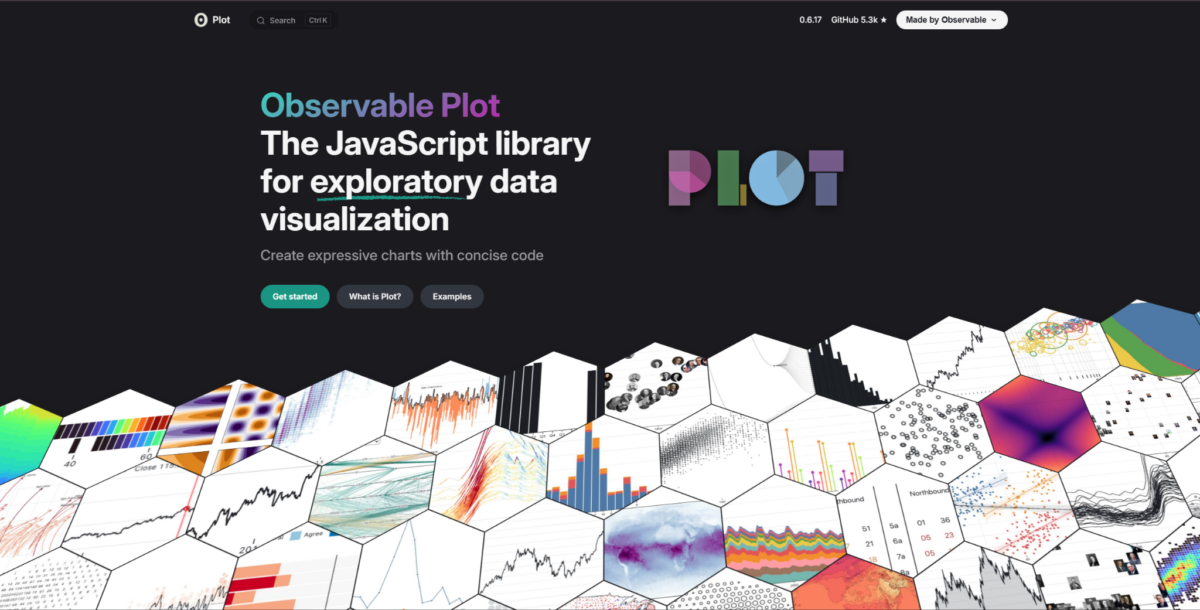
Observable Plot is a JavaScript library for fast analytical visualizations. It sits closer to data exploration, notebooks, reports, and analytical workflows than to heavy production dashboards. Data teams, analysts, and developers can use it to test visual ideas quickly. It is not a replacement for high-performance chart engines. Observable Plot helps when analytical speed and data clarity matter more than deep UI engineering.
The library helps create clean charts without excessive manual work. It is especially useful for exploratory analysis, internal reports, and data-driven content. That makes it a practical option before deeper product visualization work begins. Its value is clearest in analytical workflows where clarity matters more than heavy interface logic:
- Helps create clear charts for analysis, reports, and exploratory workflows;
- Uses a concise approach that reduces manual chart setup;
- Fits notebooks, internal research, and data-heavy editorial projects;
- Supports teams that need fast visual checks before deeper product work;
- Makes sense when clarity and speed matter more than deep UI engineering.
Observable Plot suits analytical tasks, but not always complex interactive products. If you need custom interactions, advanced product UI, or commercial implementation support, compare it with other options. Treat it as a tool for fast analytical visualization, not a universal charting platform.
Where It Stands Out
Observable Plot is useful when a team needs to turn a dataset into a clear visual story quickly. It fits analysts, data teams, and editorial data projects. For complex SaaS dashboards or heavy browser workloads, other libraries should be tested first.
4. Vega-Lite
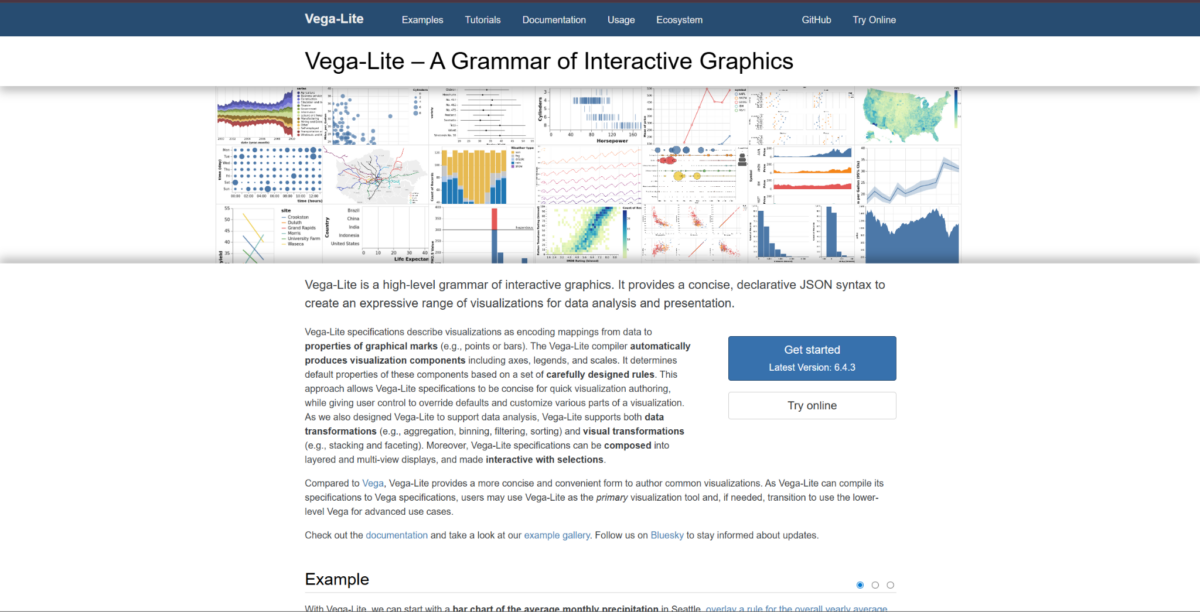
Vega-Lite is a declarative visualization grammar where charts are defined through structured specifications. This approach helps when teams want to describe charts systematically rather than build every detail manually. Use cases include analytics tools, research products, internal dashboards, data platforms, and educational interfaces. Vega-Lite is not the best option for maximum low-level control. It makes sense when consistency, repeatable chart definitions, and structured visualization workflows matter.
Vega-Lite helps teams standardize their approach to charts. Instead of manual code for every detail, the team works with declarative specs, which can simplify repeated visualization tasks. This is useful when charts need to be shared, reviewed, changed, or generated in a consistent way. Its strongest points come from structure and repeatability:
- Uses declarative specifications for building charts;
- Helps teams keep visualization logic structured and repeatable;
- Supports analytical products, research tools, and internal dashboards;
- Makes chart definitions easier to share, adjust, and review;
- Fits workflows where consistency matters more than manual drawing control.
Vega-Lite makes sense for products where charts need systematic, repeatable descriptions. It may be less natural for teams that want full manual control over interaction or presentation. It is a good option for structured analytical environments, but not for every frontend product.
Strongest Use Cases
Vega-Lite suits data platforms, research dashboards, and internal analytics tools. Its main strength is repeatable chart specifications and structured visual workflows. For highly branded visual interfaces or heavy real-time interactions, other tools may be a better match.
5. Billboard.js
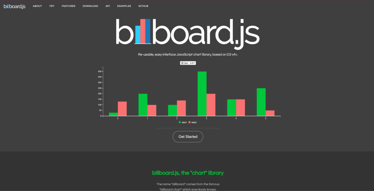
Billboard.js is a JavaScript chart library built on D3 with a simpler path to standard charts. It works for dashboard pages, reports, admin interfaces, and web apps where teams do not need to build everything manually. Billboard.js provides a more ready charting layer than raw D3.js. It is not a tool for the heaviest data-heavy products. It makes sense when a team wants D3-based charting without the full low-level approach.
Billboard.js covers typical charting tasks and can speed up dashboard development. It is useful when a product needs standard charts, simple interactions, and a familiar JavaScript setup. That makes it a practical middle option between raw D3.js and heavier commercial toolkits. Its main value is straightforward chart delivery:
- Provides ready chart types for dashboards, reports, and admin pages;
- Uses D3 under the hood while reducing manual setup work;
- Supports common charting needs without forcing full low-level development;
- Fits teams that want standard visuals with reasonable setup time;
- Makes sense for web apps where charts are useful but not the main technical risk.
Billboard.js can be convenient for standard dashboard scenarios. If the product needs advanced 3D visuals, heavy rendering, or complex custom interaction, other tools may be better. Billboard.js works best as a practical middle ground between ready charts and a D3-based approach.
Main Advantages
Billboard.js is strongest in simplicity for typical charts. It suits teams that do not want to write everything from scratch but also do not need a heavy enterprise toolkit. Its role in this list is to cover lighter standard visualization needs inside complex web apps.
Best Fit by Project Type
The choice depends on what makes your web app complex. If the problem is large datasets, fast rendering, and complex interaction, SciChart is the clearest fit. If you need full control over a custom visual language, D3.js gives the most freedom but requires more engineering work. Observable Plot and Vega-Lite work better in analytical workflows, research tools, and structured visualization tasks. Billboard.js suits teams that need standard charts faster than a fully custom visualization layer.
Final Thoughts
Complex web apps do not all need the same charting library. SciChart fits where advanced visualization, large datasets, and user interaction are critical to the product. D3.js, Observable Plot, Vega-Lite, and Billboard.js cover other scenarios: custom visuals, analytical exploration, structured specs, and standard dashboard charts. Do not pick a library only by popularity or polished examples. Test with real data, interaction patterns, and frontend team requirements before committing.